UmsButton
通用按钮组件
属性
| 属性名 | 类型 | 默认值 | 说明 |
|---|---|---|---|
| type | String | default | 按钮的样式类型 |
| size | String | default | 按钮的尺寸 |
| value | String | 按钮内的文字 |
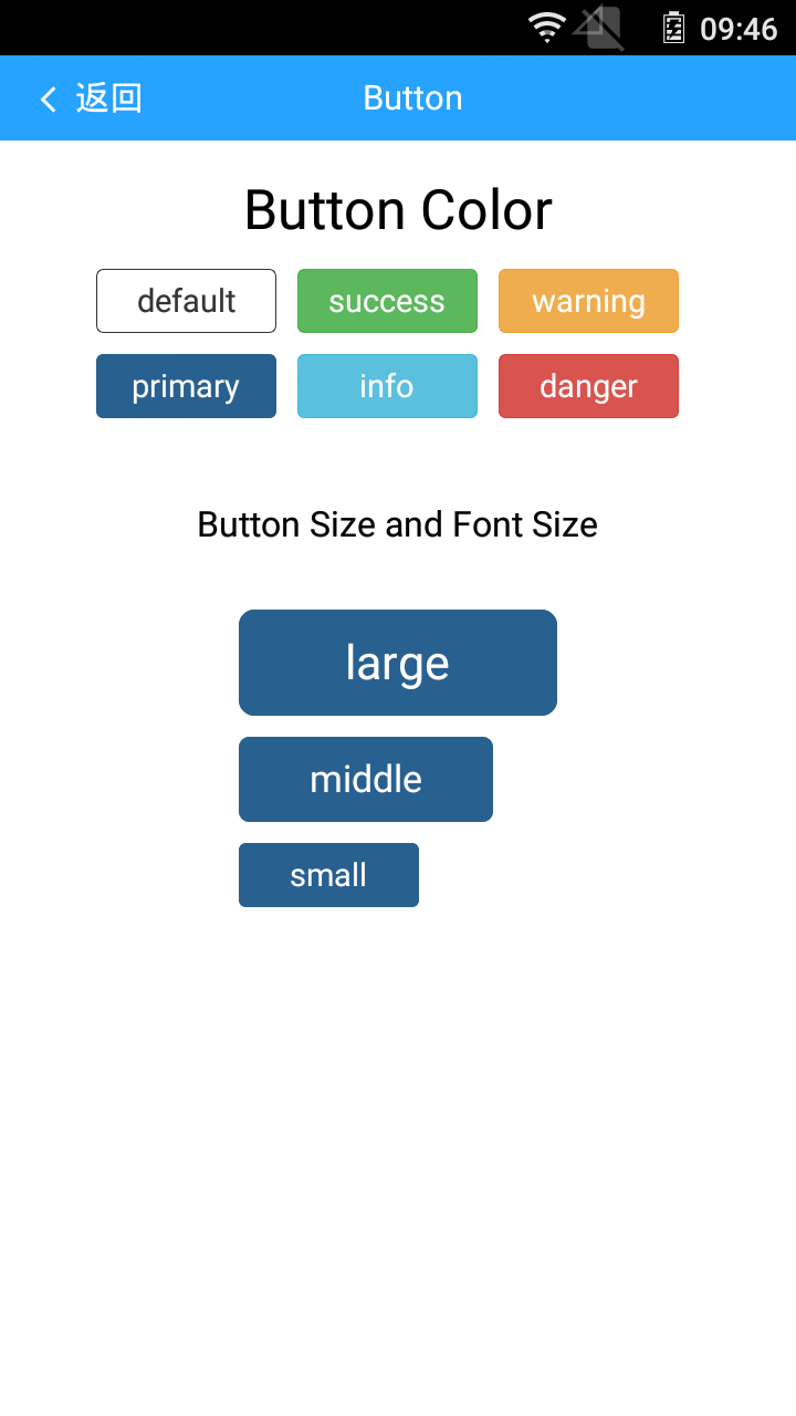
type的有效值
| 值 | 说明 |
|---|---|
| default | 无背景颜色 |
| primary | 背景颜色为#286090 |
| success | 背景颜色为#5cb85c |
| info | 背景颜色为#5bc0de |
| warning | 背景颜色#f0ad4e |
| danger | 背景颜色#d9534f |
size的有效值
| 值 | 说明 |
|---|---|
| large | 宽度为300px,高度为100px |
| middle | 宽度为240px,高度为80px |
| small | 宽度为170px,高度为60px |
子组件
支持文字作为子组件
<ums-button>hello world</ums-button>
<ums-button value="hello world"></ums-button>
事例代码
 <template>
    <div>
        <ums-header title="Button" :right="false" leftPartText="返回" @onLeftPartClick="back"></ums-header>
        <div class="wrapper">
            <h :level='2' value="Button Color"></h>
            <div class="btn-group-color">
                <div class="btn-box">
                    <ums-button class="btn" type="default" value="default" size="small"></ums-button>
                    <ums-button class="btn" type="primary" value="primary" size="small"></ums-button>
                </div>
                <div class="btn-box">
                    <ums-button class="btn" type="success" value="success" size="small"></ums-button>
                    <ums-button class="btn" type="info" value="info" size="small"></ums-button>
                </div>
                <div class="btn-box">
                    <ums-button class="btn" type="warning" value="warning" size="small"></ums-button>
                    <ums-button class="btn" type="danger" value="danger" size="small"></ums-button>
                </div>
            </div>
            <div class="title">
                <text class="text">Button Size and Font Size</text>
            </div>
            <div class="btn-group-size">
                <ums-button class="btn" type="primary" size="large" value="large"></ums-button>
                <ums-button class="btn" type="primary" size="middle" value="middle"></ums-button>
                <ums-button class="btn" type="primary" size="small" value="small"></ums-button>
            </div>
        </div>
    </div>
</template>

<script>
    import {UmsButton,UmsH,UmsHeader} from 'ums-comp';
    var navigator = weex.requireModule('navigator');
    export default{
        components: {
            UmsButton,
            UmsH,
            UmsHeader
        },
        methods:{
            back(){
                navigator.pop()
            }
        }
    }
</script>

<style scoped>
    .wrapper{
        align-items: center;
        margin-top: 10px;
    }
    .title{
        margin: 60px;
    }
    .text{
        font-size: 48px;
        color: #aaa;
        font-weight: 400;
    }
    .btn-group-color{
        flex-direction: row;
    }
    .btn-box{
        margin-right: 20px;
    }
    .btn{
        margin-bottom: 20px;
    }
    .btn-group-size{
        flex-direction: column;
    }
</style>
效果展示